I love building brands and solving problems. AI can draw a logo in seconds, but the mood, the colors and what a brand really feels like still take a human.
The difference is made in decisions AI won't make for you: which mood, what each color says, and which name people still remember tomorrow.
A name that carries meaning instead of just sounding nice. A logo and mark that work even at small sizes.
A color palette with a reason to exist, not just "looks good". Fonts that fit the brand's voice.
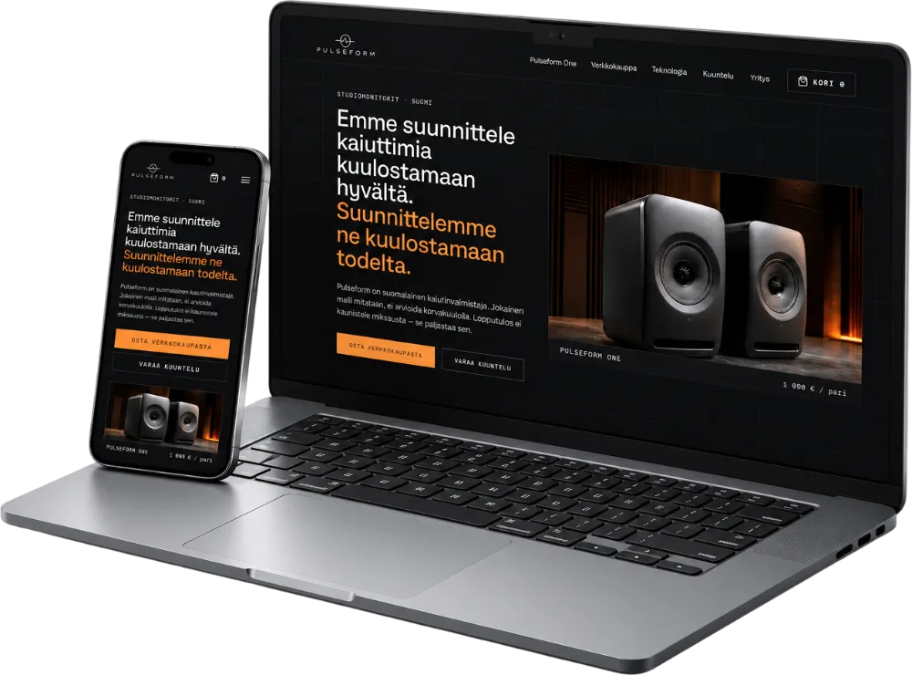
The brand applied to a real website: the style of buttons, cards and forms, not just a style guide PDF gathering dust.
Pulseform combines pulse (rhythm, sound pressure) and waveform (what sound draws when you measure it). From the name onward, we built a dark, technical and restrained identity: a single accent color, no decoration, and trust built with measurements instead of adjectives.
What the brand needs to solve, who it speaks to and why the current look (if any) isn't working.
The name, the story and the one sentence that sums up why the brand exists.
Colors, typography and visual language, not separate choices but one consistent whole.
The brand is applied to a real website and materials, so it lives on instead of staying a style guide.
The scope ranges from just a logo to a complete visual system, so the price is always tailored to your needs. Tell me about your challenge and you'll get a personal estimate.